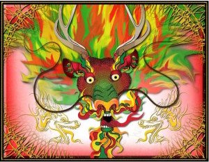
This is a piece that gives an identity to the idea of a dragon and the Chinese culture. The colors are placed next to complementary colors throughout the piece to create harmony. The weight of the hair stands vary to suggest movement representing the energy of the culture and the new year of the dragon.
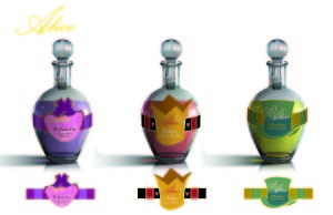
This is a creation of an identity for the tea brand, Alice. The striped band is used on each flavor to create pattern and balance in a way which has an alice in wonderland feel. The thinner band places emphasis on the object in the middle which represents a certain character.
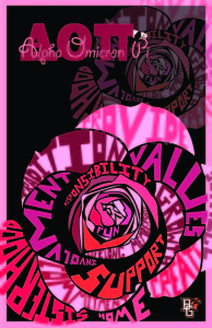
This poster promotes the Alpha Psi chapter of Alpha Omicron Pi (AOII) which is a greek organization. It uses type to create a pattern of a rose which emphasizes the organizations values and traditions. The rose is repeated to create balance and harmony to reiterate the unity of the Sorority.
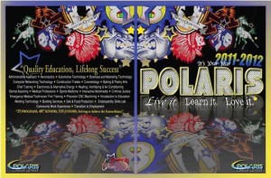
This in an informational piece about Polaris Career Technical School. emphasis is placed on the school logos to showcase the unity of all the different high schools. Emphasis on the logos is created though pattern and scale.
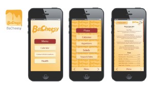
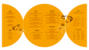
This is a creation of an identity for BaCheezy Pizzeria. The reiteration of the colors and logo creates rhythm and harmony throughout the works. The Movement of the cheese create a playful feel and helps establish the identity of the restaurant.
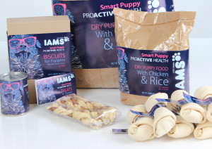
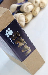
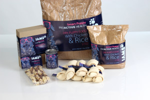
This is a recreation of the smart puppy line of Iams dog food. The repetition of the glasses, dog, type and colors are used to create balance, harmony and rhythm to convey a playful feel. I also used emphasis on the puppy with glasses to give the identity a hipster feel.
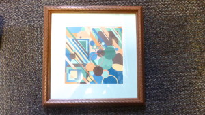
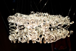
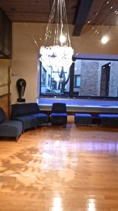
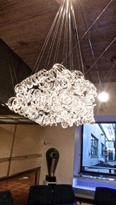
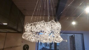
This is an informational piece about the properties of glass. It uses pattern and rhythm to convey movement. some pieces of the glass are bigger to convey the natural process of glassblowing. lights are used to illuminate piece and create a pattern on the floor representing movement and beauty of the process.
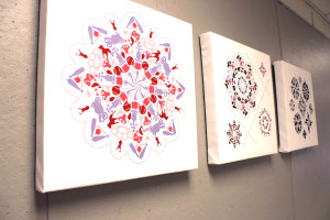
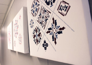
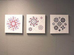
his is an piece that tests the identity of woman though pattern, colors and objects. The elements are placed in a pattern to emphasize a feminine or masculine design.
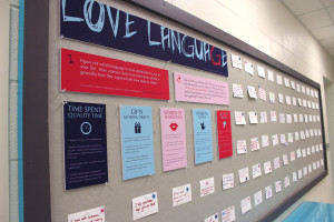
This is an informative piece about the 5 love languages. The signs are designed in order of hierarchy to convey Harmony and balance. The bigger the sign the more important it is.

Sea Turtle-Colored Pencil and Ink (2018)


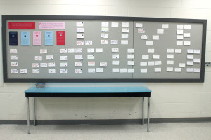
This informational piece was created for American Greetings. The “Thank Tree” is meant for employees to be able to help brainstorm new card ideas by showcasing all the people they would like to thank and why.
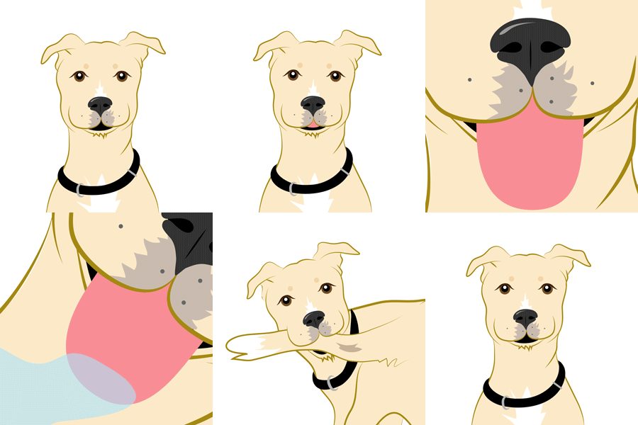

illustration for Primary Colors (Adobe Illustrator)


 Primary Colors Candy Gummy Tub Patterns (Adobe Illustrator)
Primary Colors Unicorn Bottle (Adobe Illustrator)
